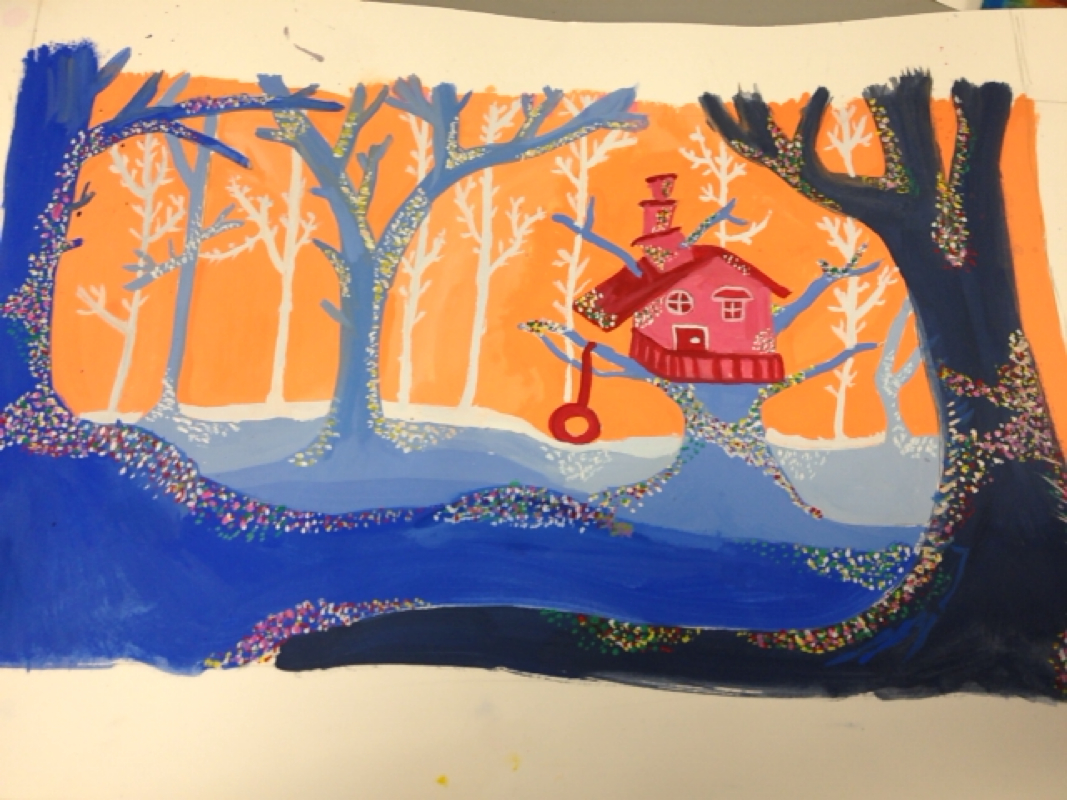
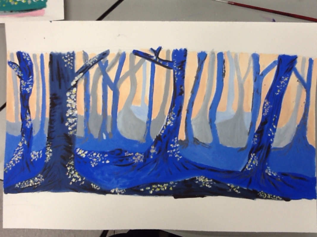
This is my landscape painting. I was inspired by the tree house in Peter Pan that the lost boys live in. I made the sky a peachy color and the tree house a pink and red because I thought it made it more of a cheerful mood. I made my detail dots different colors and made the trees father on the back have less bright colored dots and more light colored dots. I used blue for my trees and made them get darker as they got closer to the front of the painting.


This is my spooky tree painting. I used different shades of blue and a light pink color for the back ground. l


This is my unsymmetrical notan and I sort of like it but not a lot.

This is my unsymmetrical notan my wo colors are pink and black which are vastly different hues and values. The are curved lines and it is non narrative.


This is my symettric notan and I do not really like this one. The colors I chose were orange and yellow which are analogous colors. I made it look some what like a sun but I don't think its narrative.


This is my narrative Notan and it's of the Seattle skyline. I really like this one. I chose two colors that I thought represented the picture well. My colors have vastly different values and hues. The two main colors are green and white

Person

12/17/2013

0 Comments


This is aang from avatar. When I was drawing my face it ended up looking like him so I drew and arrow so it was

I learned while drawing this picture in class how to draw the eyes more proportionate and make them look more real rather than cartoon eyes. I also learned how to shade the upper lip to make the bottom one stick out more and look more realistic also. I enjoyed mrs Heideman helping teach us step by step how to draw a face better because it helped me make it actually look like a face rather than a cartoon.


I can now porportionatly draw a face and I was able to use the pastels to make different shades in my drawing. I decided to draw a picture of Davis. I liked being able to use pastels to shade but I had a hard time starting out my drawing. Some art elements I used were shading so that Ivan make the light in the picture look more real in the drawing.

Rubric

I can resketch my pencil drawing for a value pastel drawing with the correct porportions

5

I can softly define features with the correct size in relation to each other and the head

5

I can create unified image with a sense of emphasis on the face or part of the face

5

I can indicate three dementions by using a wide rande of values for shadows and highlight

5

I can paint with defined chalk marks so I create clear textures for skins hair and any other details.

5


In my narrative collage I have the message of two different life styles. My collage has similar colors in it and represents the life style of a athlete and a musician.


This I my two colored collage. I created symmetry by having pictures that are similar in shape and colors on each side of my paper. I used green and blue because they are next to each other on the color wheel


This is my one colored collage. I made it so my color is darker in the background and lighter up front. I centered all my lighter color in one area. Having my color over lap makes it look like the brighter colors are popping out.

    Author

    Write something about yourself. No need to be fancy, just an overview.

    Archives

    No Archives

    Categories

    All